YJ의 새벽
CSS ( 레이아웃, flex , grid ) 본문
--성배 레이아웃.
--성배 레이아웃은 5개의 영역으로 구성.
-- 화면 최상단에 ( 헤더 header , 풋터 footer )
--그 사이 영역에 ( 네비게이션 nav , 메인 main , 사이드바 aside ) 영역으로 나누어짐.
EX )))) 레이아웃 예제
<!DOCTYPE html>
<html>
<head>
  <meta charset="utf-8">
  <style>
    .clear {
      clear: both;
    }
    header {
      width: 800px;
      height: 60px;
      margin: 2px;
      border: solid 2px #ff0000;
    }
    aside {
      width: 175px;
      height: 398px;
      float: left;
      padding: 2px;
      border: solid 2px #ff0000;
    }
    nav {
      height: 150px;
      margin-bottom: 50px;
      margin: 2px;
      border: solid 2px #0000ff;
    }
    main {
      width: 618px;
      height: 400px;
      float: left;
      margin: 2px;
      border: solid 2px #ff0000;
    }
    section {
      width: 500px;
      height: 150px;
      margin: 2px;
      border: solid 2px #00ff00;
    }
    footer {
      width: 800px;
      height: 90px;
      margin: 2px;
      border: solid 2px #ff0000;
    }
  </style>
</head>

<body>
  <header>
    상단 헤더
  </header>
  <aside>
    좌측
    <nav>
      메뉴
    </nav>
  </aside>
  <main>
    메인 콘텐츠
    <section>
      콘텐츠 1
    </section>
    <section>
      콘텐츠 2
    </section>
  </main>
  <div class="clear"></div>
  <footer>
    하단 푸터
  </footer>
</body>

</html>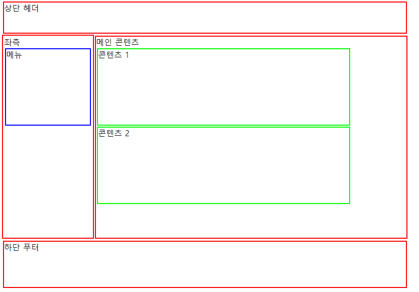
***CSS Flex ( Flexible Box )
-- 한방향 레이아웃 시스템
-- 레이아웃 배치 전용 기능으로 고안됨.
-- 화면 크기에 맞춰, 화면 안 아이템들의 넓이/높이를 최적으로 맞춘다.
-- float , inline-block 등을 이용한 기존방식보다 편리하다.
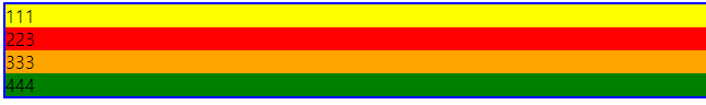
EX )))) flex 예제
<!DOCTYPE html>
<html lang="ko">
<head>
    <meta charset="UTF-8">
    <title>flex 예제</title>
    <style>
      .box{
        border: solid green;
      }
      .box-container{
        display: flex;
      }
    </style>
</head>
<body>
    <div class="box-container">
       <div class="box">111</div>
       <div class="box">223</div>
       <div class="box">333</div>
   </div>
</body>
</html>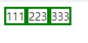
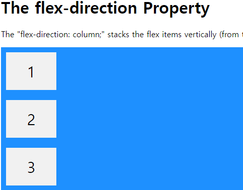
EX ))) flex- direction 예제
<!DOCTYPE html>
<html>
<head>
<style>
.flex-container {
display: flex;
flex-direction: column;
background-color: DodgerBlue;
}
.flex-container > div {
background-color: #f1f1f1;
width: 100px;
margin: 10px;
text-align: center;
line-height: 75px;
font-size: 30px;
}
</style>
</head>
<body>
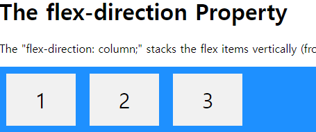
<h1>The flex-direction Property</h1>
<p>The "flex-direction: column;" stacks the flex items vertically (from top to bottom):</p>
<div class="flex-container">
<div>1</div>
<div>2</div>
<div>3</div>
</div>
</body>
</html>
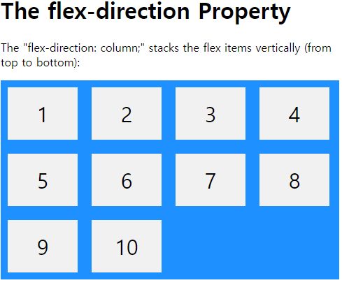
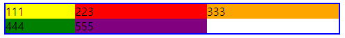
------------------flex-dirention : column
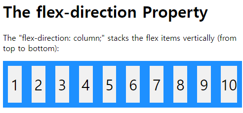
------------------flex-dirention : row
------------------flex-wrap: wrap
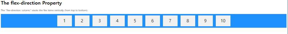
------------------flex-wrap: nowrap ( 기본값 )
--------------------------------------------justify-content : center
***CSS Grid ( 그리드 )
--두 방향 (가로,세로) 레이아웃 시스템
--그리드 컨테이너 , 그아래 자식으로 그리드 아이템이라 부르는데,
컨테이너가 Grid 영향받는 정체공간이고, 설정된 속성에 따라 각각의 아이템들이 어떤 형태로 배치되는것.
--display : grid ; 로 시작한다.
--grid-template-rows : 행의 배치. ** 1fr 1fr 1fr : 1:1:1 비율로 3개 만들겠다.
gird-template-columns : 열의 배치.
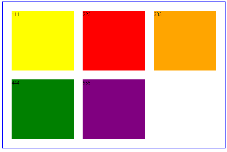
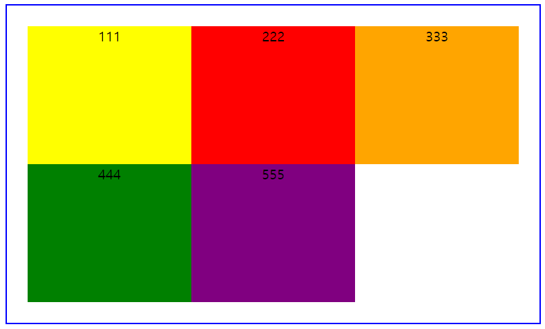
EX )))) grid 기본예제
<!DOCTYPE html>
<html lang="ko">
<head>
    <meta charset="UTF-8">
    <title>grid 예제</title>
    <style>
      .container{
        display: grid;
        border: 2px solid blue;
      }
    </style>
</head>
<body>
    <div class="container">
       <div style="background-color:yellow;">111</div>
       <div style="background-color: red;">223</div>
       <div style="background-color: orange;">333</div>
       <div style="background-color: green;">444</div>
   </div>
</body>
</html>
------------------- display : grid ;
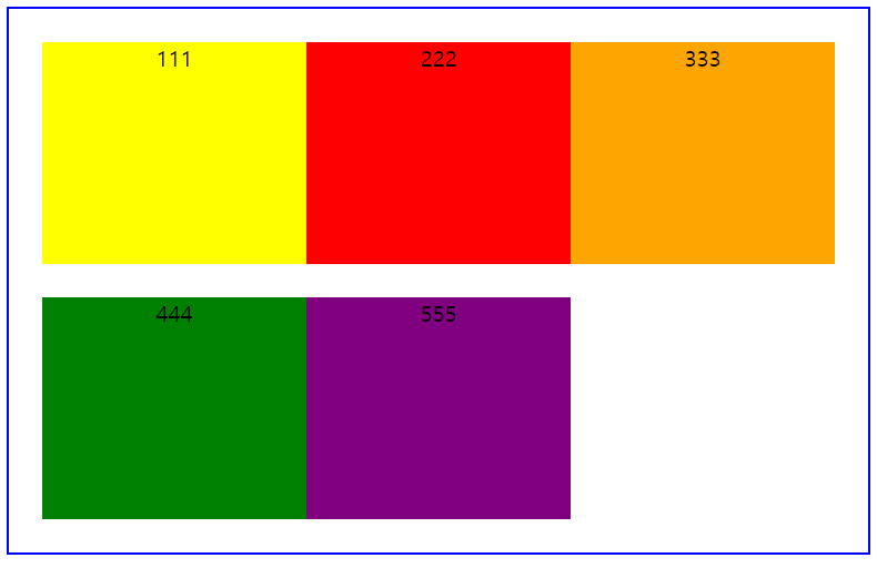
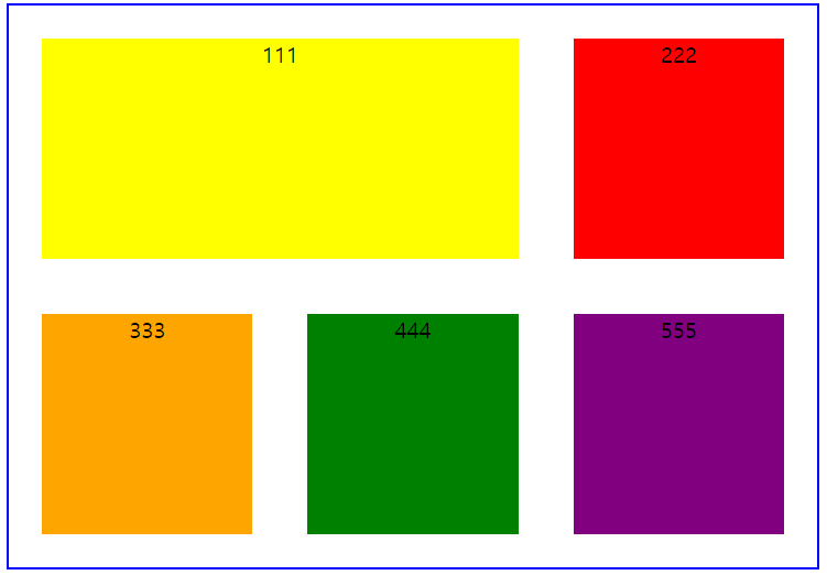
-------------------grid-template-columns : 1fr 1fr 1fr 1fr ;

-------------------grid-template-columns : 100px1fr 1fr ;
-------------------grid-template-columns : 1fr 1fr 1fr ;
-------------------grid-template-rows : 200px 200px ; row-gap :30px; column-gap : 30px; padding: 30px
-------------------column-gap : 0px ;
-------------------row-gap : 0px ; --> gap : 0px 0px or gap : 0px 로 줄수있다.
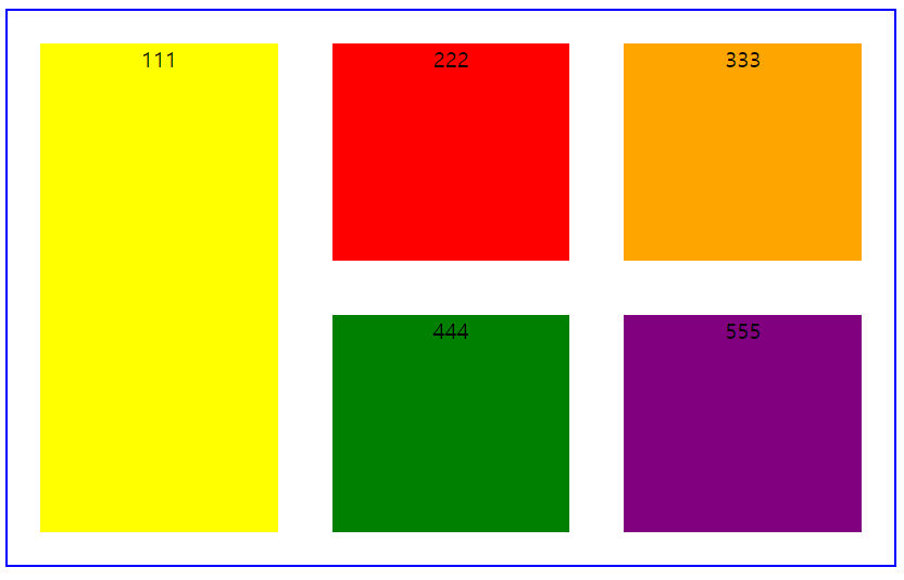
-------------------grid-column-start : 1 ; grid-column-end : 3 ;
-------------------grid-row-start : 1 ; grid-row-end : 3 ;
** 요소를 쉽게 중앙 으로 배치하는 방법
-- 가로방향에서 정 가운데로 배치
-- 세로방향에서 정 가운데로 배치
-- <div> 사용.
1. magin : auto (수평정렬)
2. display : flex (flexbox)
jusidy-content : center
align-items : center
3. position : absolute
top : 50%
left : 50%
transform : translate (-50%,-50%)
EX ))) 수직,수평 예제
<!DOCTYPE html>
<html lang="ko">
<head>
    <meta charset="UTF-8">
    <title>수평,수직 정렬 예제</title>
    <style>
        body{
            margin:0;
            padding:0;
        }
        .parent{
            display:flex;
            justify-content:center;
            align-items:center;
            border:1px solid green;
                        /* 100vh: viewport(브라우저 화면) height */
            height:100vh;
            margin:0px;
            padding:0px;
        }
        .child{
            width:100px;
            height:100px;
            background-color:aqua;
            display:flex;
            justify-content:center;
            align-items:center;
        }
    </style>
</head>
<body>
    <div class="parent">
        <div class="child">
            123
        </div>
    </div>
</body>
</html>
CSS Grid 완벽 가이드
CSS Grid(그리드)는 2차원(행과 열)의 레이아웃 시스템을 제공합니다.Flexible Box도 훌륭하지만 비교적 단순한 1차원 레이아웃을 위하며, 좀 더 복잡한 레이아 ...
heropy.blog
CSS Grid Layout
W3Schools offers free online tutorials, references and exercises in all the major languages of the web. Covering popular subjects like HTML, CSS, JavaScript, Python, SQL, Java, and many, many more.
www.w3schools.com
--참조하겠습니다.
https://d2.naver.com/helloworld/8540176#ch2
1분코딩 블로그
웹 창작자들을 위한 꿀정보들!
studiomeal.com
참조하겠읍니다.
CSS를 이용한 HTML 스타일링 익히기 - Web 개발 학습하기 | MDN
CSS(Cascading Stylesheets – 종속형 스타일시트)는 HTML을 익힌 후 가장 먼저 배워야할 웹기술입니다. HTML이 콘텐츠의 구조와 의미를 정의하는 반면 CSS는 스타일과 레이아웃을 지정합니다. 예를 들어, C
developer.mozilla.org
참조하겠읍니다 .
'WebFront_ > HTML,CSS' 카테고리의 다른 글
| CSS ( 레이아웃, display ) (0) | 2023.02.21 |
|---|---|
| CSS ( 반응형 웹디자인 ) (0) | 2023.02.10 |
| CSS ( 레이아웃 ( position )) (0) | 2023.02.07 |
| CSS ( 레이아웃 ( float )) (0) | 2023.02.07 |
| CSS ( 폼 (input,로그인,회원가입)) (0) | 2023.02.06 |


